Thursday, 31 October 2013

A Smattering of Random Renders did suddenly appear!

 Just a collection of recent and not so recent renders and bits of photoshoppery that I've done over the past year or so. Enjoy!


Mock-up Fake Poster for a Prequel to "Apollo 18" (Photoshop)

Same as Above, this was the first go at it (Photoshop)

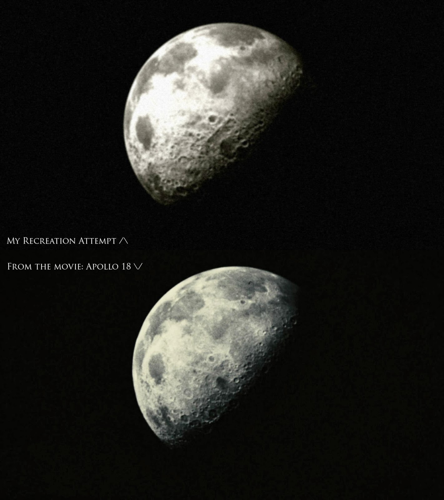
A Recreation of the moon shot from the movie "Apollo 18" (Cinema 4D and Photoshop)

Martian Destroyer Beauty shot (Cinema 4D and Photoshop)

Martian Battleship in low Orbit (Cinema 4D and Photoshop)

An Architectural Study (Autodesk XSI)

"Mach Speed" DVD Cover art (Cinema 4D and Photoshop) 

The Mach Speed Racers flawlessly imported into XSI

The Mach Speed Racers as modeled in Cinema 4D


The AER-9 Laser Rifle from Fallout 3 (High Poly Model Study)

Plasma Rifle Concept from Fallout 3 (High Poly Model Study)


Martian Cruiser (Cinema 4D)

A small scene inspired by S.T.A.L.K.E.R. and Metro 2033


Soviet Moon Landing (Photoshop edit)

The Tardis from Doctor Who

Testing a Lens Glare effect that's NOT done in post. All done in the same scene


Ambient Occlusion Render of scale models (These can be 3D printed!)

Cover Art Test Render for the 2nd Seas of Sand Anthology

Thursday, 18 July 2013

Project: SnapDragon (Update 2)

It's been some time since my first update on the SnapDragon Project, and since then there's been a fair amount of work done.

Let's take a look and I'll talk about the changes and the reasoning behind them!

Ambient Occlusion multiview
 List of changes:
-Ditched the V tail for a regular single fin tail, just sloped back a bit.
   - It looked cool in the blueprint, but ultimately didn't seem to fit into the design.
-Ditched the Big wing mounted engines for some intakes feeding into a single fuselage mounted engine.
   - Again, looked cool, but for a fighter/interceptor, it was just too bulky feeling.
-Changed the cockpit to something a bit more aerodynamic (and almost like an A-wing cockpit)
   - This was more of a happy accident, I tried to make a bubble cockpit like the Spitfires, but happened upon something that looked and fit better with the design.
-Added more details here and there (including a pilot!)
   - Details are the spice of life!

After I had those changes, I decided it was time to texture! I used a late war colour-scheme on the SnapDragon and ran with it.

Textured/Ambient Occlusion multiview

As you can see, it didn't turn out all that bad!

After the SnapDragon had been textured and refined here and there, I deemed the project done and started to work on a few other things to make it better and more real. Such as making a separate model with landing gear, which you can see below.

A Landed SnapDragon on a runway.
With the project done, I'll leave you with a few more renders that I made.

Fake Black and White Photograph.

SnapDragons flying above the clouds.
As always, leave your comments and enjoy!

Saturday, 18 May 2013

Containing Costs for Cover Art

   One concern I know many people have when seeking out 3D art is cost. In this marketplace, it's tough to know what prices will be, whether you'll be hit by hidden costs, etc. I don't think that's necessary, and when I make my services available I always price my work as fairly as I can -- especially for books. As a writer myself, I know the joy of seeing your story in print, and I want to help as many people as possible enjoy that experience.

   I've had a long-term working (and writing) relationship with Iceberg Publishing (www.icebergpublishing.com), and having produced dozens of images and videos for their books, I've learned many tricks to economize my time, while keeping quality high. I make this experience available to writers and small publishers too, and to help provide guidelines for what costs might be for independent authors and small presses, here are some examples:

Defense Command: "Tapestries of Blood" Cover Image (Cropped Image)
 $200 - $250 Canadian

Defense Command: "2235 Omnibus" Cover Image (Full Cover Image)
 $250 - $300 Canadian

Seas of Sand: "Finding the Range - Anthology I" Cover Image (Back and Front Covers)
 $350 - $400 Canadian

The Equation Series: "The Destiny Equation" Cover Image (Cropped Image on the Back Cover)
$150 - $300 Canadian

   Unfortunately, I do charge more when working with large publishers, or other industries... but for authors and small presses, it's basically work at minimum cost. Once I do an image, I pass all rights for it to the customer, and if we do multiple images of the same ship, additional discounts might be available, depending on how complex (if you need multiple angles for a ship schematic, for instance).

   So if you're an author trying to get your vision of one of your ships onto a book cover, or a small press looking for quality CGI that you can afford, I'd like to help. Email me if you have any questions!

Wednesday, 13 February 2013

New PC and some new worlds!

A terraformed Europa

   Instead of a paragraph to start out explaining what I've been doing, I posted an image instead. It's made using a new shader I downloaded off the net and located here: http://www.welter-4d.de/fplugs/freeplugins_en.html

   I had been searching for a way to make realistic looking atmospheres, because it's slightly important if you're doing a lot of space related scenes. So finding that plugin is a BIG life saver, plus having a new PC definitely helps the render time.

Terraformed Europa with mighty Jupiter in the background
   Speaking of new PCs, the specs for my new PC is here:

Intel Core i7 3770 (3.4Ghz)
16 gigs of RAM
2 TB HDD
Nvidia GTX 660

Compare that to my old PC:

AMD Dual Core X2 5000+
4 gigs of Ram
500 gig HDD
Nvidia GTX 260

It's a VERY big upgrade and it was VERY much needed.


   The last two images are related to Defense Command, and the upcoming "Black Sun" Sequel. The one above is more related to the later as the Martian ships are from that post-war period. They've got a new Tri-engine configuration along with the last of the Tharsis Class Battleships.


   The last image is more or less a work in progress. I'm recreating the cover image from The Articles of Empire. I'll post a more finished version of this when I get around to it.

   Until then, enjoy the images and see you later!

Tuesday, 23 October 2012

Project: SnapDragron (initial update)

Well now, it seems as though I haven't posted in a while. But now that has changed! I got something new and interesting for you guys today!

This is what I've been working on over the past few days. This little series of updates will chronicle the making of an alt-history bent wing jet, The SnapDragon.

This project was set before me by Kenneth Tam, my friend and a pretty damn good writer of a number of different sci-fi series. He wanted a jet for one of his upcoming books and didn't know what it'd look like. So he gave the project to me and within a couple hours I sent him these.
Made from a simple blueprint of the Corsair.

A modified Gloster Meteor.

A Modified Spitfire.

He reacted extremely positive to all of them, but decided on the modified Spitfire. From there I took the blueprint image of the Spitfire and made some modifications to the image to give him an idea of what the finished SnapDragon would look like.

The Modified Spitfire blueprint.
From there he gave the go ahead to start the modeling process and by the next night I had come up with this image.


What I hadn't realized in making the SnapDragon up until then, was that it looked like a bird in mid-dive. Which after some thought, seemed like something designers of the time would've looked at for inspiration. So it worked out spectacularly.

From there it was off to doing a number of different revision and edits. Below you can see my efforts to date.


Just doing some texture tests in Photoshop. It's starting to come together I think...

This is where I'll leave you guys today, there's still a lot of work ahead, but it'll be worth it!

Until then,

Enjoy and leave your comments!


Sunday, 8 July 2012

Get out of here S.T.A.L.K.E.R.

   No, no. You can stay! It's a fairly iconic line of dialogue mentioned (a number of times) in GSC Gameworlds cult hit/smash/epic, S.T.A.L.K.E.R. Shadow of Chernobyl. As I'll tell you now, I've have been playing a fair amount of that series in the past week and it's carried over into the 3D world!

   First up is a render of some Pripyat apartment blocks based on a photo I found while surfing Google. I think these turned out fairly well!

The Grass is done using a colour image and an alpha image on a plane and then have it duplicated and spun a couple degrees. Same with the Trees

   After I was pleased and happy with the results I took that image into Photoshop and did a bit of tweaking and editing until I got to this image!


Old Timey filters and distance blur added, plus a bit of fiddling with the Levels.

   Once I was happy with that I went ahead and did some more searching on Google for a Radiation sign and the S.T.A.L.K.E.R. Call of Pripyat game logo. Once I had those elements, it was a short time later that I came up with this, the finished product!

I'd say that's none to shabby!

   So, I had done that up after I had completed Call of Pripyat...So, in keeping with the theme of doing something like that after finishing a game...I did up a Desktop Wallpaper for Shadow of Chernobyl as well!

All Photoshop using real world photographs!
   As you can tell by the caption, that's all Photoshop. Showing off what I can do with it might help one day in getting a job...but we'll see! Never hurts to show off your skills!

Until next time!

Enjoy and don't hesitate to comment!